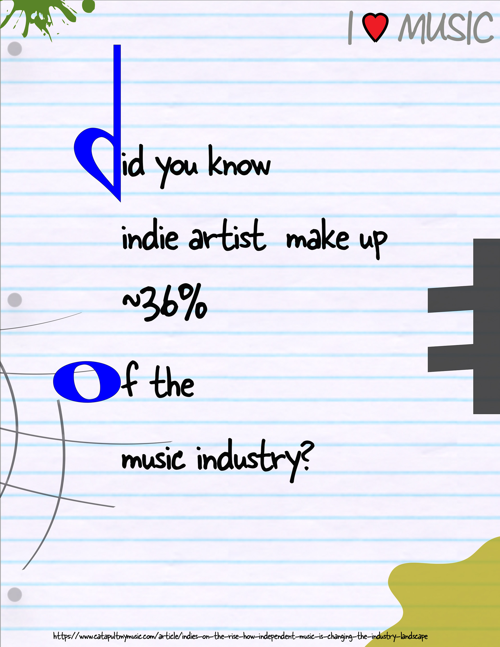
A music inspired pictograph to bring awareness to indie artists. I improved the pencil holes and shading to make it more paper-like. And added more design.
My logos project, I really enjoyed making the yellow block one, as it different and goes against normal design rules and CMU branding. I've seen that style done and wanted to try and replicate and but my spin on it. I added the two logos at the bottom.
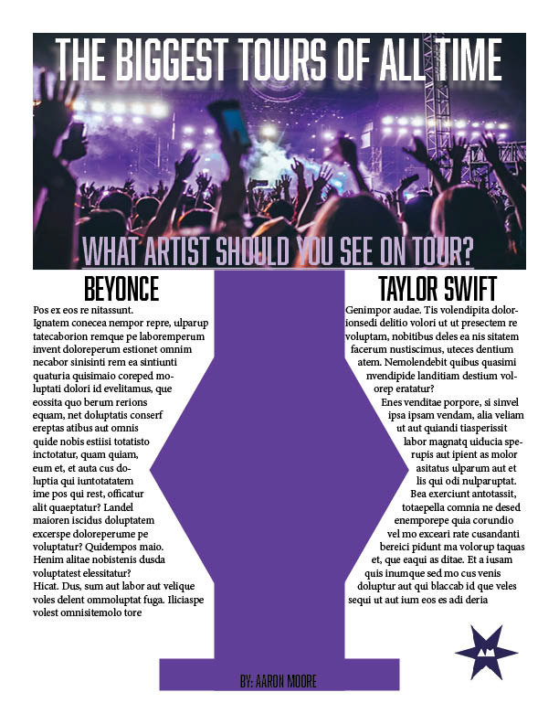
This was my wet layout to showcase some of the biggest tours. I revisioned the stroke lines and the title besides that the design was strong just needed tweaks.
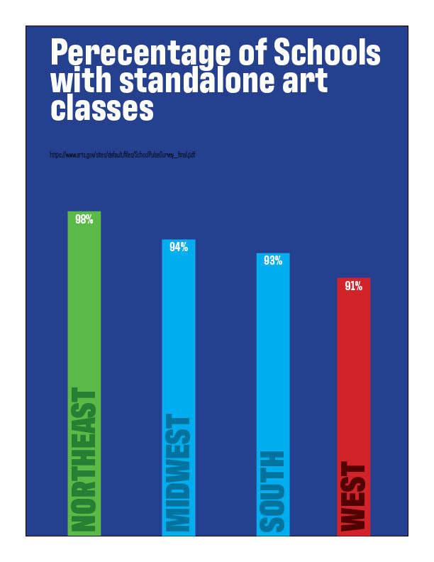
I fixed the bar lines and the tiles arrangement to make it cleaner and sleek along with being readability. Along with moving the source link from feedback.
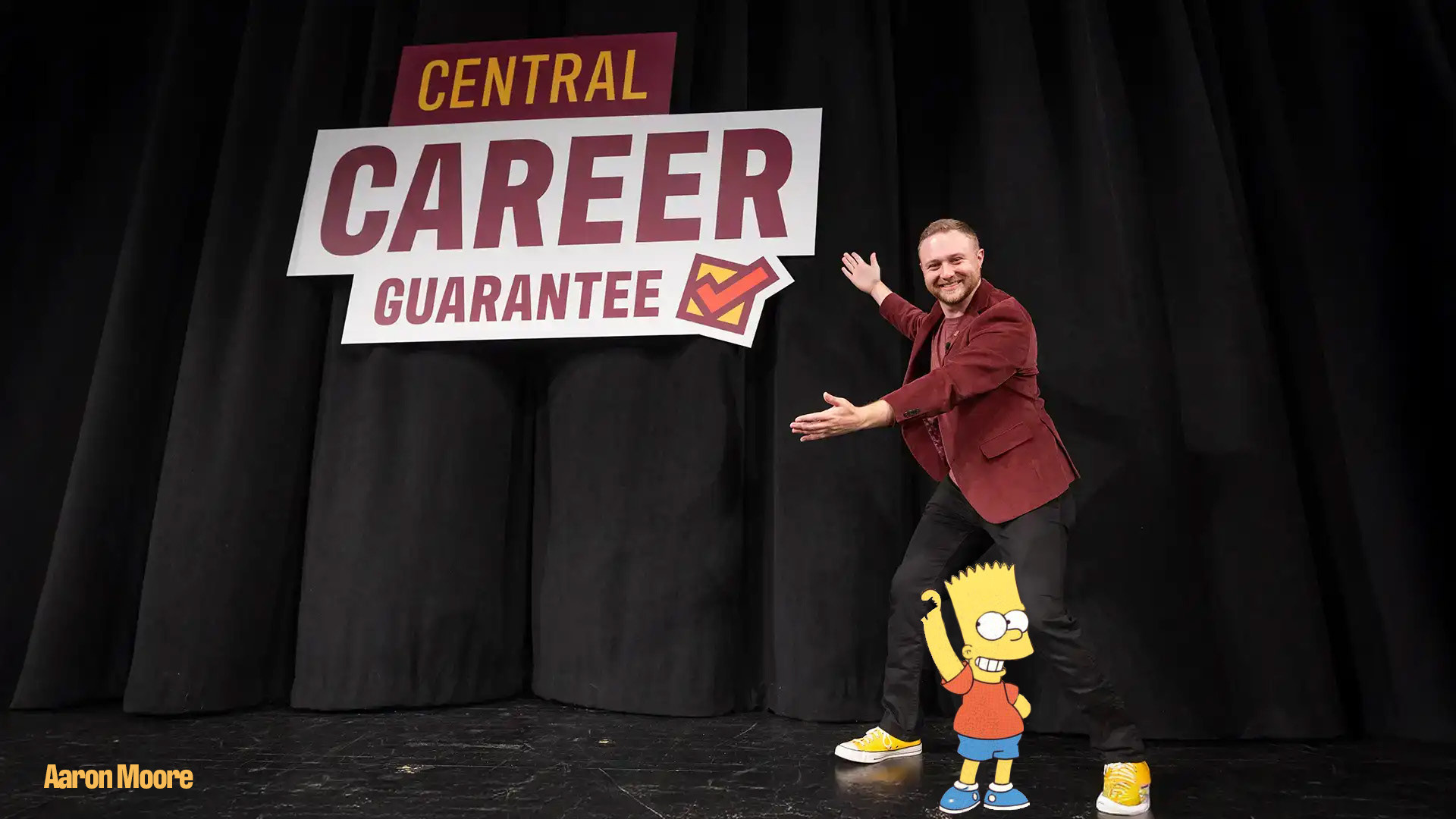
This was my Simpson design project, I originally did Homer but ended up doing Bart because of his clutched fist, which I used to my advantage to make it look like Bart is pulling on Michael's leg.
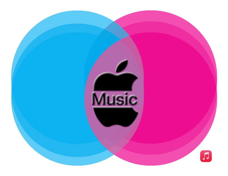
I spliced the apple logo to make it make retro like the music splitting the apple. And also added the current logo in the bottom for promotional reasons. I rearranged the circles to make the purple haze for the 'apple sandwich'